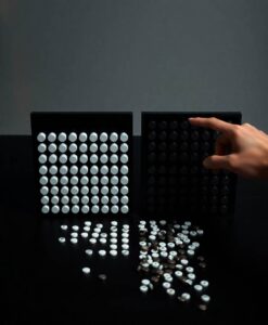

The research behind this article tested whether variation in icon shapes and their arrangement changes how many icons people think they see. When icons were neatly grouped, people judged proportions accurately even if shapes varied. When icons were scattered randomly, however, having one category made of a single shape tended to inflate its apparent size; the uniform shape stood out and looked more numerous even when it wasn’t.
That effect matters for anyone who creates visual explanations of risk. Small perceptual choices can steer attention and tilt judgments in ways that affect decisions about health, safety, and fairness. Read the full article to learn which design practices protect against these biases and how clearer icon arrays could support better, more inclusive choices.
Abstract
Icon arrays are graphical displays in which a subset of shapes are filled to represent the probability of an outcome (e.g., the probability of side-effects from a medical treatment). Prior work has shown that the perceptions of probabilities can be more accurate with icon arrays compared to other formats. As a result, they are now widely used to communicate information about risk and uncertainty to the general public. However, little is known about how the design of icon arrays—in particular, the perceptual characteristics of icons and their spatial arrangement—affect perceptions of risk. The present study builds on research on visual perception which suggests that variation in icon shape may affect their perceived numerosity. Three experiments were conducted using a proportion judgment task with icon arrays that varied in (a) whether icons were organized in grouped or random configurations, and (b) whether there was variability in the icon shapes used to represent the target and nontarget proportions. The results show that proportion judgments are highly accurate for grouped arrays, with no effect of shape variability regardless of the distribution of shapes across the target and nontarget categories. For random spatial arrangements, however, irrelevant shape variability in one (but not both) of the categories leads to biased proportion judgments, increasing the perceived quantity of whichever category has elements with the same shape. These findings show that perceptual variation in shape—while irrelevant to the proportion judgment task—can alter how people perceive quantities depicted by icon arrays, providing new insight into how these visualizations should be designed to communicate information about risk.